Monday, December 19, 2011

December Spotlight-Mitsouko and Rouge


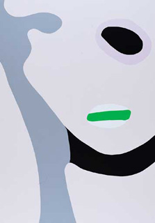
Mitsouko and Rouge  oil on canvas  92x76cm

This painting which I still have at home( as I am always making small adjustments here and there), seems to be an occurring theme of mine.  A female figure looking in a mirror at her dressing table.  It’s just something that hits a note of recognition and empathy within me, and spending some time thinking about its source; of course I do know its origins.  I think we all have role models and heros as young children; adults in our lives that influence us, both negatively and positively.  I feel that we are all very selective in what we want to extrapolate from experiences, and I have certainly done that in my life.  I used to watch captivated as my gran would” put on her face” every morning in front of her 3 sided dressing table mirror, with her silver backed hair brushes, pots of rouge and face powder.  Dabs of foundation were applied with a formulaic dexterity; pouting to receive the strong application of colour which she then carefully toned down by positioning a tissue between her rubied lips.  She used to let us sit there for a while( or maybe I just sneaked back when she was otherwise occupied, selective memory again), excitedly opening perfumed pots and using the fairy tale hair brushes.  But what a shock to look in that 3-sided mirror, and to gaze at the strange side profile that was undeniably me, but not a me I had seen before, such visual adventures and discoveries that have imprinted and remained with me still.
Another very influential women of my past was an aunt, she was so bohemian and cool.  Her house smelt of rush matting, garlicy continental cooking and Guerlain’s Mitsouko perfume.   I re-lived these childhood memories of visiting my cousin’s house, by buying a bottle of this perfume about 15 years ago.  And it completely delivered on every count, I so love this perfume.  Mitsouko and Rouge is a tribute painting to all those strong actualized women that somehow managed to create their own very personal imprint by changing the atmosphere around them, simply by celebrating and delighting in their womanhood. 

 Dressing Table  92x76cm oil on canvas Alizarin exhibition 2006

Friday, November 4, 2011

November Spot-light on 'Firelight"


Apart for the brief 10 days or so when this painting ‘Firelight’ was exhibited as part of my solo show at Adam’s in October 2005, it has been a permanent fixture in my sitting room.
It’s large painting 122x92cm oil on canvas, and depicts 2 female figures playing chess infront of an open fire.  This painting for me is all about composition. It’s the second painting that I did with this subject matter, the first ‘Firelight’ was in a square format and finished with the top of the fire surround, so this was the second composition and a lot more contrived as a result.    I am not always so obviously aware of picture construction as I was with this one, but for this reason I can genuinely discuss the buildup of this painting, without any worries that I am reinventing after the event, as after all painting is a dynamic process where a lot of the decision making happens in the moment of the paint hitting the canvas and all previous ideas and concepts get sidelined in the pure action of the front line of painting.
  For me the centre of a painting is where the eye naturally first rests, so here I have intentionally taken advantage of this phenomena and placed all the action centrally. This, I feel, creates more perceived energy within the painting and heightens the sense of visual drama for the viewer.  So from the top of the painting in central position I set the clock, which I use in an obvious way, simply to help define the moment, a way of illustrating time in a pictorial way, which in turn, helps to illustrate that snapshot moment when a memory is retained, captured and treasured. Then the eye moves down to the dynamic flames in the hearth, and then onto to the middle of the chess board, where a game is in progress.   All the attention from the figures is focused on the chess board, where one is about to move a piece.  I then shift the emphasis away from the central action, and direct the eye around all the areas of the canvas by using compositional devices of either mirror imagining paired objects (as in the figurines on the mantelpiece),  or obvious diagonals transecting the central line, as in the wood grain of the table.   This helps to direct the viewer’s eye outwards to all corners of the canvas.  Hopefully giving the painting a sense of balance like weighing scales.
On hind-sight, this painting brings to mind, for me, that effect of when you scatter random blobs of wet paint on one side of a piece of paper , then fold in on itself and press, to then open out and reveal a complete balanced integral shape like a butterfly.  There is something very satisfying and calming about this form of symmetry, it feels so right to look at, like some primal patterning that represents the origins of life.
The reference points for this painting, would be Matisse’s ‘The painter’s family’, which I have known and loved so well all my painting life, and which he painted in 1911.  There are such obvious links here with my ‘Firelight’, as can be seen with the central fireplace and the intimate feel factor of Matisse’s sons playing out the action of the game across the chequered board.  Matisse so cleverly uses hot reds and warm earths in his palette (more reminiscent of Vuillard’s work) to reinforce and heighten the depiction of warmth and intimacy of the family scene.  On a more personal note, ‘Firelight’ is a homage painting to TCD’s senior common room as it was in the 1980-90’s.  On the few occasions that I visited this area of the common room, there was always a fire blazing in the grate, newspapers ready to be read, well-worn leather armchairs, chess tables with games half played out,  walls lined with glass fronted bookcases, and the ticking of a clock, with a scattering of Persian rugs criss-crossing over the coir matting, with their jewel like colours of cadmium reds and viridian greens.  For me, that room had that timeless elegant appeal of Georgian functionality.   
'The Painter's Family' Henri Matisse 1911 

Monday, October 24, 2011

October Spotlight- The Bowl of Milk

The Bowl of Milk oil on canvas 122x92cm
The idea for this painting came from Bonnard’s masterpiece of the same name, which I have always loved and greatly admired spending many hours poured over the image in books.  When I looked around the Tate modern in London in 2008, I came across Bonnard’s Bowl of Milk suddenly, and it was like bumping into an old friend, that sense of sheer joy of recognition still lives with me today. 
Bonnard conceived his painting, during a restless night when he couldn’t sleep.   He had friends staying over, and on entering his moon-bathed kitchen, he surprised his lady guest about to give the cat a bowl of milk.  She was wearing a long pink nightdress and she and the whole room was bathed in moonlight that was flooding through the window. How intoxicating is that?
My composition evolved slowly and though I painted it in 2009 for the Pastoral Collection it was never exhibited as I was still living with it and working on some unresolved areas.   It’s now one of my favourite paintings, as it is both atmospheric  and balanced yet  visually complex and  challenging to look at.
This painting has recently been sent to my new London gallery The Russell Gallery  in Putney, and will be exhibited in their upcoming  Christmas group show .

Pierre Bonnard The Bowl of Milk oil on canvas 116.2x121.6cm, Tate Gallery, London

Saturday, October 22, 2011

Picture This


Clearing through the muddles in my studio the other day, I came across a couple of torn out pages from a 1999 november issue of the vogue.  It was an interview with the artist Gary Hume, that I found great empathy  with at the time and still quote from to this day.  His words still resonate with me in particular his description of how he eventually freed himself from  the shackles of the art establishment and the weight of all that art history, by seeing himself primarily as a creator of pictures rather than paintings. This new mindset freed up his former frustrations  and creative block and enabled him to work in a productive and positive way.  From that moment on he never looked back and  his inspiration was self generating and sustainable.
I know it doesn’t sound much,  but sometimes a sideways look at a problem that’s stopping your progress,  can be the difference between staying static , too  frightened of really exploring your chosen path;  or getting over  that self-inflicted obstacle, and going forward along the rewarding path of personal development in search of your own personal truth whatever that might be.
Picture This an interview with Gary Hume by Andrew Graham-Dixon, Vogue Nov. 1999.


“The very reasons that painting’s thought to be dead are the reasons I love it. It’s very old. It’s very simple. It’s very direct. It’s very primitive.” Gary Hume, who is himself a kind of knowing, modern primitive, is sitting in the kitchen-cum-dining-cum-living-room of his studio, a converted warehouse in
Hoxton Square
in
East London, where he has lived and worked for the last ten years. Stubble-cheeked and self-possessed, he wears a white T-shirt and jeans spattered with paint - sticky drips of the standard household gloss which he has used, from the very start of his career, in preference to Old Masterly oils. The most conspicuous feature of the room is an amazingly pink curved sofa, like a stuck-out tongue.

If painters are, as some believe, an endangered species, then Hume for one is not going quietly. At 37 he is both the most prominent and the most active - manically active, some might say - English painter of his generation. He represented Britain in June of this year at the Venice Biennale. In August he exhibited new works in a one-man show at the Edinburgh Festival. This winter (26 November-23 January) he will be showing even more new work, in yet another one-man show, this time at the Whitechapel Gallery. Having experienced more than his fair share of creative block and crisis in the past, these days it seems that Hume can’t stop painting. “At the moment it’s as if my work is feeding off itself - there’s this weird parasitic feeding going on. Each time I paint a picture I can see another whole one in a small part of it, so I go on and paint that.”

The pictures in question are large, bright, elegant and frequently disconcerting, not least in their incorrigible variousness. The subjects of this prolific, unpredictable artist have included birds, snowmen, fashion models, minor celebrities and rabbits. He is currently painting a series of pictures of angels because he likes the idea of  “imagining an angel looking”. He says this with a solemn child-like seriousness that brings to mind that other English seer and painter of mystic visions, William Blake, who once saw a tree full of angels on a bit of scrubland near Peckham. Hume is self-confessedly inconsistent, eccentric, playful and elusive. He is also one of the very few genuinely fashionable painters to have emerged in Britain since the 1960s. His most arrestingly odd pictures, including a portrait of Tony Blackburn metamorphosing into a four-leaved clover and another of Kate Moss, her face rendered as an anonymous disc of burnished metal, have insinuated themselves into the fabric of modern life. Such images have escaped the ghetto of contemporary art and entered the contemporary world. In doing so, they have acquired the rare quality of unavoidability. Almost everyone has seen them, or images derived from them, somewhere at some time.

But while Gary Hume is, it would seem, the pre-eminent Painter of Now, he is also an enigma. His unprecedentedly shiny paintings are mirrors in which it is evident that something which touches modern sensibilities has been caught and reflected. Yet just what that something might be is open to question - and it is an odd but incontrovertible fact that even Hume’s most enthusiastic supporters seem quite unable to agree about the significance of his work. Indeed, they seem unable even to agree about its nature. Bryan Robertson, the sharp-eyed author and curator who organised the first Rothko and Jackson Pollock exhibitions in this country, back in the late 1950s, acclaims Hume as “the real thing” and says that “I believe he is essentially an abstract painter for whom a degree of figurative imagery provides a crucial trigger”. The New York-based art critic Lisa Liebmann, on the other hand, argues precisely the opposite: “despite the flirtation with abstraction, he appears at heart a figurative artist.” Liebmann adds that “there remains the matter of what Hume’s work is about” - a subject on which, like so many other critics and commentators to have been seduced by Hume’s work, she remains unhelpfully silent.

Talking to Gary Hume, the enigma himself, can feel a little like interviewing the Sphinx. He has a tendency to answer questions with riddles of his own or with statements of a poetic but gnomic kind. On the figurative/abstract question, as raised by Liebmann and Robertson, he simply declares it “a meaningless distinction of the kind critics sometimes make”, implying (and he is surely right) that all painters are essentially amphibian in this respect. He also says that he does not terribly like to talk about his pictures and what they mean. “I find it very difficult to talk about what I do, and about what other artists are doing, at the moment. Everybody is doing something, and everybody is doing something different, and what is art anyway? I don’t know what the value of it all is. I’d prefer not to talk about my art at all in a way, because it’s too scary - it might be rubbish, and you might say it, and I’d have to believe you.”  Just as he has developed a number of different modes of painting, so too in conversation he seems similarly discontinuous and changeable. He oscillates between  a disarming, almost embarrassing openness about his aims - “I want to paint something that’s gorgeous, something that’s perfect, so that it’s full of sadness” - to a cloaked and mildly self-ironising taciturnity. Having managed the rare feat of achieving fame and success as a painter, without anyone pinning him down, he is not about to give himself away now.

This does not come across as a conscious strategy of self-concealment, but as an attempt to keep his confidence intact (nothing is more important to an artist as Matisse remarked, than his self-esteem) and, simultaneously, to stay true to the nature of what he makes. Hume conveys the impression that talking about the meanings of his paintings misses the point of them, somehow - that in trying to say what a picture is about, a risk might be run of destroying or at least damaging the thing itself. He suggests that what his paintings mean actually has very little meaning for him, in the end - that he does not think in those terms and that they aren’t really, in the end, about anything at all, but are attempts to capture what he cares about, which might be an image or a thought or a feeling (or a bit of each, mixed together). Asked if he paints to express himself, to explore himself, to find himself or to avoid himself, he answers no to all of the above. “I paint to try and recognise myself”.

Hume’s pictures of animals - originally derived, like most of his works, from magazine and textbook images traced, projected, repainted and otherwise rearranged - are perhaps the epitome of this oblique and nervy enterprise, this attempt to find a way to catch parts of the self that cannot easily be articulated. Rescued from banality by his edgy, cloisonne compositions and dissonant palette, Hume’s Blackbird, or his several Rabbit paintings, seem like double-distanced versions of the self-portrait genre. The blackbird, poised on a snowy twig, against a mass of abstract foliage, with its single beady round eye, could be about to give song or take flight. The dumb creature, perpetuated in art, has acquired another form of eloquence. It is as if, in picturing it, what Hume was really after was the picturing of a feeling: a kind of wary, melancholy, self-reliant solitariness, the solitariness of the artist in his studio, even.

Poised and consummately art-directed into what can seem, at first sight, like a form of affectless cool, many of Hume’s paintings actually make an old-fashioned appeal to humanity. They may encapsulate what has often been thought or felt but do so in new and arresting ways, placing an uncommon slant on common experiences or perceptions. Faceless Kate looks like a reflection on fame and how the glamour it confers is so often accompanied by a sense of distance, both from the self and others. The so-called Water Paintings on which the artist has been working this year are layered images of female nudes, drawn in a cursive line, one superimposed on another. Looking at them is like looking back in time, like remembering old friends and lovers, or of confusing memories with fantasies. They have the iconic quality of some Pop Art, Hume’s idealised, emblematic nudes, but the effect of the pictures is less brash and upfront than much Pop: this is painting as reverie rather than billboard. At a time when much modern art gives the impression that it was designed primarily for the approbation of an in-crowd, Hume’s pictures are unusually approachable, and he has done much to dispel the prevalent popular conception of modern painting as a rather obscure and specialised activity.

Although Hume will not himself be drawn to comment on others’ interpretations of his work, he is happy that people should want to interpret it. “When a painting’s finished it has to have room in it, a space for other people to inhabit. I don’t paint narrative pictures, pictures with a definite story to them, because it’s too limiting, too closed-down.” Thinking out loud about this, he wonders why it is that he should nevertheless love the paintings of Hogarth, the English narrative painter par excellence. He concludes that “Hogarth could paint great narrative pictures because he was always looking out at others, whereas I only ever look into myself. He could do it and I can’t. If I painted narrative pictures it would be hideous, like playing a tape of myself back to myself.”

Self-recognition is alright, in other words, but self-indulgence is out. There will be no messy autobiography, no expressionistic heroics. Hume is a painter who sets out to snare his own thoughts and emotions on the wing, before they’ve settled, and to present them, mediated, in the guise of images of other things. Distance is important to him. “If I can make a picture so it’s like when you focus off into the distance, and you’re thinking - if the painting can be like that I can bear looking at it.”

If Hume has striven for anything, over the years, it is a lightness of touch and attitude. He found his freedom, as a painter, he says, when he disburdened himself of heavyweight art historical ambitions - a moment symbolised for him by his decision to stop thinking of his works as “paintings” and start calling them “pictures” instead. “I realised that it’s pictures, it’s pictures that I like. I love the phrase ‘Picture this’, and that’s basically what I try and do, I try to picture it. Earlier in my life, when I thought that what I was doing was making paintings - when I described them as paintings - I felt I had the whole history of painting to worry about, and how they were going to sit within that. But as soon as I called them pictures, because there are so many millions of pictures in the world, because it’s a category that includes almost everything, the field was so big that I felt free again. It was a completely liberating false construct, but one that I needed at the time, just to allow myself to do things.”

Hume’s “paintings” became “pictures” during the early 1990s, when he completed what was seen, by many close to him at the time, as a near suicidal volte-face. Having graduated from Goldsmiths’ School of Art in 1988, he had come to prominence - together with such close contemporaries as Damien Hirst, Fiona Rae and Rachel Whiteread - almost dangerously early in his career. He had an influential and dynamic young dealer, Karsten Schubert, and his paintings were being avidly collected by Charles Saatchi and other leading connoisseurs of the cool art of the time. He was painting what promised to be an infinitely extensible series of pictures which looked abstract at first glance but which were all, in fact, based on the shapes and designs of the doors to be found in hospitals, with their portholes and kickplates. Hume’s paintings then epitomised a certain type of chic but glum postmodernism, being works which seemed to declare that modern art was itself in the terminal ward, that it had come up against a blank and closed door beyond which lay only the yet blanker condition of death. To perfect these exemplary parodies of modern painting, and to exonerate himself from even the slightest suspicion of tastefulness, Hume even got his friends to select the colours they were painted in (they were very beautiful, for all that, bearing out the general rule that almost every Minimalist or Conceptualist is a closet aesthete).

Hume’s pictures were all the rage, circa 1990-91, and a long and profitable future turning out increasingly honed variations on the nihilistic and polyvalently portentous theme of the Closed Door seemed to lie in wait for their creator. But the trouble was that Hume had grown disillusioned with his own disillusionment. The titles of his paintings became ever-increasingly acerbic (a picture bitterly called More Fucking Values marked a watershed) and then he simply stopped painting them altogether. Instead, he made a short movie - “a serious funny film” - with the self-hating title Me as King Cnut (sic). Hume played the starring role, sitting in an overflowing bathtub, fully clothed, wearing a cardboard Burger King crown and trying to tell a joke without ever reaching the punchline. After a minute of bathos, the film abruptly ends. Having thus not so much disowned as dismembered his own artistic persona, the artist found that his dealer had dropped him and he suddenly became poor.

He thought of making more films but, having already worked for a while in documentary television, he realised that he was not cut out for any form of collaborative work. He had worked his way up to the position of assistant film editor in his early twenties, shortly before applying for art school - “but I used to argue with the directors and producers all the time, because I hated the way they twisted the material for the sake of ratings.” So, having made a King Cnut of himself he abandoned film and returned to paint. His only rule was that he must paint the things that he cared about, and he has been doing it ever since.

Hume describes his abandonment of a winning formula, not as an act of heroism or bravado, but simply as an inevitability. At Goldsmiths, he recalls he had been taught to believe that “you have to justify your practice as an artist with an idea that is reasonably intelligent and cohesive. But I suddenly found that I didn’t have any ideas that were either intelligent or cohesive.” He still has not found a rationale for the work he is doing, but says that in a lot of ways he feels richer rather than poorer for not having one. He says he found the experience of creative crisis “liberating, but very nude-making.”

Despite apparently turning his back on his own past, certain elements of continuity seem to have run through all that Hume has done. He has continued to work with gloss, which he originally adopted for his door paintings for the straightforward reason that “doors are generally painted in gloss, so I felt a picture of a door should be done in the same material”. But over they years he has grown to like it for other reasons too. “It’s like a liquid gone solid and being a wet paint that sets, it stays fluid and it reflects light. Because I don’t paint the illusion of  light, because I don’t pretend light, it’s really important that there should be light in it somehow. It also creates different levels of looking, so you see the picture and then, as you are looking further into it, suddenly you see yourself reflected, and then you see further behind yourself, and then you go back to the surface of the painting, the material, once again - it’s quite nice, all these small spatial leaps that you can make when looking at reflections. I enjoy them, anyway, because there’s nothing I enjoy more than looking.”

Hume remains, as his earlier work declared him to be, something of an iconoclast - still a painter who likes to have a go at his elders every now and then. Two years ago he painted a strikingly absurd portrait of Francis Bacon in brownface, as if he were wearing a mudpack or an ill-fitting balaclava, with a few strands of bright pink hair protruding from his cranium, with winking mascaraed eyes and wearing bright mauve lipstick. This weird, tragi-comic invention was an attempt, perhaps, to cut the most ogre-like of British contemporary art’s founding fathers down to size, but for all its camp, clownish absurdity it was also a compassionate, perceptive picture, in its way - a genuine portrait, in the sense that it captures some of Bacon’s own masochism and self-hatred. It is also a picture which seems to encapsulate Hume’s uneasy relationship with father figures in general. This may have something to do with the fact that he never knew his own father. He was brought up, single-handed, by his mother, the manageress of an NHS surgery, in the village of Tenterden, in Kent. “I was always stroppy at school - too stroppy to be a good student,” he recalls, “and I think one of the reasons I became an artist was to avoid the authority figures that I just couldn’t get on with.”

His aversion to those who would organise him or boss him about was brought home to Hume with renewed force recently when he took Joe, his 13-year-old son, on a weekend of mock-military manoeuvres. “Paintballing, they call it, because instead of bullets you fire these pellets of paint. I think it is probably the most hideous thing in the world. There were two men who wanted to organise everybody, because it is a kind of military thing, and somebody has to make the decisions. So I’m sat there, not really enjoying it, and hurting, because the effing things hurt when they hit you, with these great bruises on me, and I’m watching these two men getting taller and taller, and speaking louder and louder, and then I notice that they’ve started speaking to each other with their hands behind their backs now, as they’re organising all these kids to go into this maelstrom of paint - and I’m sat there thinking ‘Oh my God, this must be what it is like in a real war - these idiots are going to send me to my death in a minute.’ Which they did, of course. Thank God it was only paint. What a nightmare. So, um, no authority figures.”

Working in his own maelstrom of paint, away from the authority figures, painting his nudes and his angels, his men with funny faces and his animals, Hume comes across as less of an angry young man than he once did. “I used to be hard-edged and now I’m woolly,” he says. “But I don’t mind.” He seems grateful for his current glut of ideas for pictures and infused with a fresh sense of painting as a field filled with possibilities. He has discovered a deep attachment, he says, to medieval art: “I don’t know any of the names of the artists, I’m no good at that sort of thing, but it’s definitely my favourite period of art. I love the way they paint things like necks. I love they way that they paint pain, they do suffering so brilliantly.” This might seem an unlikely affinity, but it has a certain logic to it, and it leads him back to where the conversation began - his love of picture-making and of painting as a medium, his love of the simplicity of an image made by a man using his eyes and his hands and some wet stuff on the end of a stick.

“One of my favourite realisations came to me recently when I had to give a lecture about my work to all these rather terrifying ladies at the Guggenheim Museum in New York. I was very embarrassed and nervous, and I said that the first thing you have to remember is that they all start off with nothing on them at all - and that seemed to me like the real point, that seemed to me to be all they really needed to know. It sounds obvious, but one of them came up to me afterwards, I remember, and she said she wanted to thank me. She said she felt very stupid, but she had got so used to thinking about art in critical, intellectual terms that she had actually forgotten that pictures start off empty. For me, that, basically, is the process, at all times. You start off with nothing and you try not to ruin it.”

The above interview is by Andrew Graham-Dixon and can be found on his website..

Friday, September 9, 2011

September Spotlight-Peeling Apples


September is the start of the apple season.
Trying to get the peel off in one go, just for that lucky wish produces that long spiraling shape with the characteristic little round ends that Metsu paints so well in his A Maid peeling Apples, a painting that I encountered when the National Gallery of Ireland put on the fabulously curated major Metsu exhibition in 2010.
I just loved the way this 17th century Dutch painter arranged his space and the devices he so cleverly invented to create his uniquely cohesive compositions.
Metsu often places his main figures dominating the foreground, in this case three quarters of the woman is shown, the basket on her lap filling the bottom right of the canvas, the table with a still life on her left and the glimpse of a grid- like chair to the woman’s right.  I repeated all these elements in my composition of Peeling Apples and my woman also has a red top, my still life on the table is a nod to those beautiful earthy Dutch Still lifes that honor earthenware pottery and kitchen interiors so well.  Metsu’s backgrounds intrigue me so much, in that he too flattens his distances bringing them to the frontal plane with his verticals and right angle preferences.  However he often uses monochromes to paint his backgrounds which help to focus on the main action of the figures and objects to the foreground.  I use the same weight and depth of colour for my backgrounds as I do for my foregrounds which helps to bring all my values within my composition to the same level and reinforces the frontal plane in a modernist approach to picture making.
It was so wonderfully surprising  to get so much useable compositional tuition from this master who was working so many hundreds of years ago.
Hopefully I have produced in my painting a cohesive and balanced composition full of lipstick colours and sumptuous textures, a domestic kitchen scene in all the good and nurturing sense of the word; where good food is produced and eaten and all is respected.
My peeling apples is currently on show at The Doorway Gallery www.thedoorwaygallery.com  in Dublin’s city centre, just around the corner from the Kilkenny Design Centre off Nassau Street.

Thursday, August 4, 2011

August Spotlight-Autumn Composition


irish painter artist orange painting autumn art cat

The spotlight this month is on ‘Autumn Composition’ from the Tapestry collection 2011 122cmx122cm oil on canvas, and is currently on show and available through The Doorway Gallery, Frederick Street South (off Nassau Street) Dublin 2.
I started painting this composition late last August.  I was inspired by a glut of courgette plants in the garden.  With the vibrant green and cream stripes of the fruits, striking foliage and beautiful soft buttery  yellow flowers, they were just begging to be painted.  So I struck out into the garden armed with a pair of secateurs and determination to see what else I could find  in and around my immediate surroundings.  My garden isn’t at its best at this time of year, when it comes down to picking flowers, spring is the best time of year here, and if it wasn’t for the ripe red rowan berries and the fushias in the hedgerows there wouldn’t be too much for my palette knife to get excited about.  However I did find some light magenta mallow flowers, some acid yellow flowering fennel, my much loved rose of Sharon and some jazzy dahlias that I pilfered from the tubs around the house.
So this was going to be a kitchen interior, with a theme based around the table, a cookery book is open on the table.  Cookery books have always held a fascination for me all my life from my early childhood in the 60’s, there was one such cookery paperback and I am sure it was an Elizabeth David, it was illustrated on the front and back with a lined black drawing, on a deep pink background, of a set table laden with good food and drink, with people sat down ready to tuck in, and on the back was the same table after everyone had eaten their fill and had departed leaving a cat on one of the chairs.  Maybe I mis remember it all and I have trawled the internet for it but to no avail.  However it still lives with me and I always think of it when I paint food on tables.
In ‘Autumn Compostion’ the yellow and magenta cat makes eye contact with the viewer, so pulling the eye to the back of the painting and so to the up ended rug which dominates the background with its woven complimentary colours of blues, greens and pinks, that help to  enhance and intensify the main dominant cadmium orange of the table, to intentionally  create even more impact. 
It turned out to be quite a challenging painting to get balanced and the cups went through a few colour changes before I settled on the rich warm earth brown that they are.
So I am pleased with this painting, as it has a sunny, uplifting effect on the senses, yet is balanced and intricate enough in its content to give back a lot of visual entertainment to the viewer.
+p.s I have found it a year and a half later well infact I have been looking for this book for decades....that is the cookery book that I mentioned earlier, I just have to add the image, as I am so excited that I have been reunited with this little book illustrated by David Gentleman, thank you Cat finding it for me, as you where researching for your 1950's interior book... so happy. And here it is in all its glory.

Sunday, July 31, 2011

How to tighten my canvases


This weekend I filmed a video with the help of my daughter Rebecca of Sparrow & Gray. A  simple solution to a loose canvas is to tighten it with wedges. In the video above I show you step by step how to do this. My canvases are sourced from Millikens Bros, a Northern Irish company that makes bespoke and very high quality canvases.

Sunday, March 27, 2011

Pat Kenny and Lucy Doyle at Doorway Gallery Dublin

Denise Donnelly, Pat kenny and Lucy Doyle
Thursday 24th March was the official launch of the Doorway Gallery on South Frederick Street as well as Padraig Mc Caul's solo show "Sentinels". The night was a great success with plenty of people in the gallery. RTE's Pat Kenny opened the gallery with an excellent and entertaining speech.

Saturday, March 12, 2011

New Paintings New Gallery

Mount Usher Gardens 61x71cm oil on canvas
Denise Donnelly (formerly owner of the Bad Art Gallery, Dublin and Deirdre O'Connell (formerly owner of the Bridge Gallery, Ormond Quay ) have joined forces and set up the new Doorway Gallery in the bustling city centre of  South Frederick Street Dublin 2.  Along side a league of prestigious art galleries, The Doorway Gallery will be bringing its own unique stable of contemporary artists to this artistic quarter of Georgian Dublin see more info at their website http://www.thedoorwaygallery.com/.
You can see Lucy's new paintings at the new gallery now and on-line. 
Official opening will be on the 24th March, opening by Pat Kenny.

Saturday, January 29, 2011

Tapestry Collection Now Online


Flower Arrangement
92 x 76 cm
Oil on canvas


A full set of images of the paintings making up the Tapestry collection can now be seen online. Link

Thursday, January 20, 2011

New Working Theme: Tapestry

Tapestry
152 x 122 cm
Oil on canvas
The paintings I have been working on since my last solo show, Persephone in 2010, have been loosely based around the theme TapestryNot that I have another solo show planned until 2012, so a theme is not particularly important to the way my work is going at the moment.  However, for a while now I have been thinking about the way a tapestry is constructed of thousands of individual woollen stitches and the similarities to the way I construct my paintings.  When a tapestry is completed its numerous raised stitches fuse together visually to become a readable picture as well as a tactile object in its own right. At any stage it is evident when looking at a tapestry of what it is composed of and that the identity of each component stitch still retains all its characteristics of wool.  In a modernist approach to painting I want to keep paint as pure to its original form as I can, so that it is evident to the viewer, that it is paint that they are looking at with all its individual properties of colour, texture and form still retained. I work with a palette knife which gives the surface of my paintings a lot of depth and texture. I like this tactile quality as it helps to maintain and establish the 2-dimensional reality of the canvas.